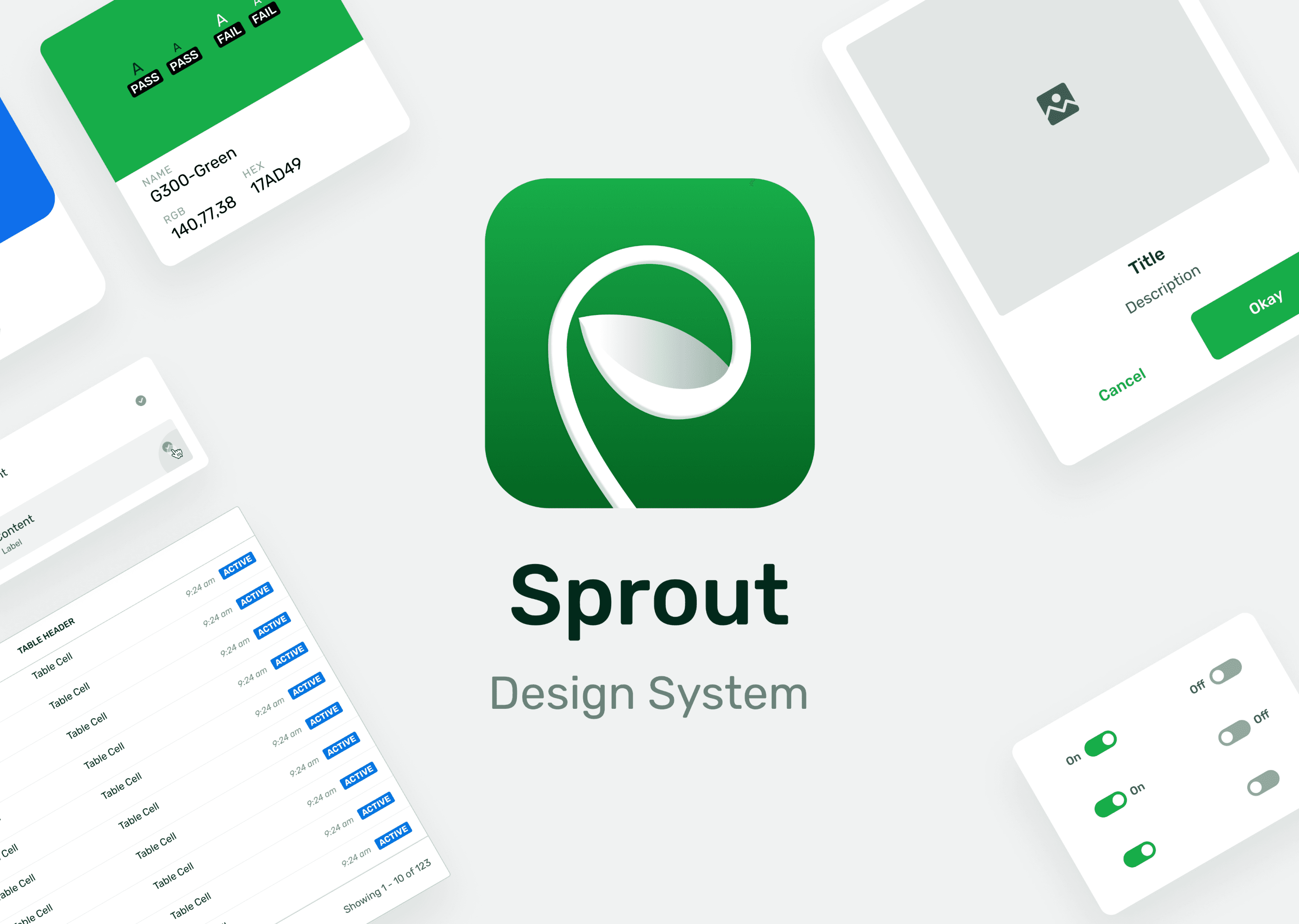
Ever wondered how a big symphony orchestra creates beautiful music without any chaos? Well that is the magic of systems and efficiency at play. Picture a chef's kitchen where every ingredient is ready at the right time, where even in a small room they still manage to deliver the best quality food in their menu without sacrificing seconds. This is the dream of every design system team. To create that beautiful symphony where every product can sing in harmony without causing any mayhem.
Context
Ever wondered how a big symphony orchestra creates beautiful music without any chaos? Well that is the magic of systems and efficiency at play. Picture a chef's kitchen where every ingredient is ready at the right time, where even in a small room they still manage to deliver the best quality food in their menu without sacrificing seconds. This is the dream of every design system team. To create that beautiful symphony where every product can sing in harmony without causing any mayhem.
Problem
There is no such thing as perfect company, nor design system. Everything has its own weaknesses, value, and inconsistencies. But why we still do it if such thing does not exists? The answer is efficiency, individuality, and consistency. We want to create a system where we can create much faster, consistent user experiences across all products, as well as talking to the customers through the language we speak, branding.


The Challenges We Faced
Unorganized
Our Figma repository is a wild jungle—components scattered everywhere, duplicate files for the same purpose, and no clear source of truth. The result? Inconsistent UI components, confusion among designers, and a guessing game on which component is actually the right one.
Inaccessible
Finding components shouldn’t feel like solving a mystery. But with inconsistent naming conventions and scattered file storage, designers struggle to locate what they need. The result? Frustration, wasted time, and an overall clunky workflow.
Unscalable
A design system should scale effortlessly, but ours? Not so much. As a company in its scale-up phase, a non-scalable system means expensive, time-consuming updates, manual fixes across multiple products, and inevitable inconsistencies creeping into designs.
Our Solutions
Figma Files Structure
Every company structures its Figma files differently—thanks to varying org charts, team sizes, and business needs. But one common thread? A well-organized system that groups core components, foundational styles, icons, illustrations, and UI elements for easy access.
Source of Truth
To build products faster and ensure consistency, we need a single source of truth—whether it’s components, icons, or illustrations. Designers should be able to find and use assets effortlessly from a dedicated library, reducing guesswork and duplication.
User Management
Even with a perfect design system, chaos ensues if everyone can edit files. Not every designer should have free rein—that’s where user management comes in. Assigning clear roles (owners, editors, and users) ensures the system scales smoothly without disrupting teams.
Components
A well-structured component library is key to design consistency, collaboration, and efficiency. Without it, expect user confusion, dev headaches, and endless maintenance struggles. Reusable components keep the design process streamlined and scalable.
Foundations
Defined foundation styles (colors, typography, spacing) are the backbone of a cohesive brand. They improve usability, speed up workflows, and create trust in the product. Without them? Expect a design free-for-all that looks as messy as it feels.
1st Scaffolding: Foundational Styles


We gathered every color, typography, spacing, and icon used across our products—because let’s be honest, things were all over the place. By aligning with other departments, we defined the official foundational styles, ensuring consistent branding and user experience. The result? Designers and engineers spend less time reinventing the wheel, and our product maintains a strong, recognizable identity.
2nd Scaffolding: Components


With the foundations in place, the next step was tackling UI components—because what’s a design system without reusable building blocks? We audited existing components, removed duplicates, and standardized designs to ensure consistency, efficiency, and scalability. Now, instead of designers creating variations of the same button (again), they can focus on actual design work while engineers implement components seamlessly.
But components alone aren’t enough—we needed clear guidelines and behaviors to define how they should be used. From interaction states to spacing rules, every element follows a structured system to prevent inconsistencies and design guesswork. This ensures that no matter who’s using the design system, everything remains cohesive, predictable, and scalable across all products.